Tag: CSS functions
-
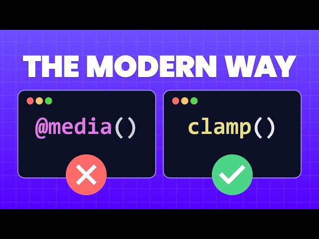
Stop Using So Many Media Queries – Use clamp() Instead!
For years, responsive design has relied heavily on an exhaustive list of media queries to adjust font sizes, paddings, and element widths across different devices. This results in bloated, difficult-to-maintain CSS. The modern solution lies in three powerful CSS functions—min(), max(), and the ultimate fluid design tool, clamp().