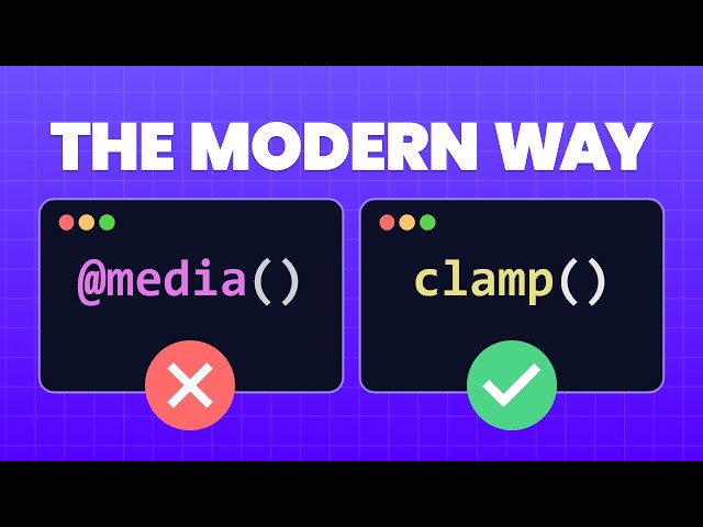
For years, responsive design has relied heavily on an exhaustive list of media queries to adjust font sizes, paddings, and element widths across different devices. This results in bloated, difficult-to-maintain CSS. The modern solution lies in three powerful CSS functions—min(), max(), and the ultimate fluid design tool, clamp().
These “magic functions” allow you to make elements super responsive with a single line of CSS, giving you precise control over minimum and maximum values without the need for fixed breakpoints.
1. The Power of min() (Setting a Maximum Size)
The min() function returns the smallest value from a list of expressions, making it perfect for setting a maximum size for an element. This is crucial for controlling containers on ultra-wide desktop screens.
- Problem: On a huge monitor, a container set to
width: 50emmight still be too small if you want it to fill 95% of the screen. Conversely,width: 95%might be excessively large. - Solution: Use
min()to combine a fixed maximum with a flexible unit.
CSS
.container {
/* Always use the smaller of the two values */
width: min(50em, 95%);
}
This ensures the container is never wider than 50em (the fixed maximum) but will shrink down to 95% of the screen on smaller devices [00:45].
2. The Utility of max() (Setting a Minimum Size)
The max() function returns the largest value from a list of expressions. Although it seems counterintuitive, this is the function you use to ensure a minimum size for an element.
- Problem: A sidebar set to
width: 25%might look fine on a tablet, but on a small mobile screen, 25% might be too narrow to display its content properly. - Solution: Use
max()to ensure the element doesn’t collapse past a certain point.
.sidebar {
/* Always use the larger of the two values */
width: max(250px, 25%);
}
The sidebar will be 25% of the screen size most of the time, but if 25% becomes smaller than 250px, max() forces the width to stick to the minimum of 250px [01:47].
3. The Ultimate Tool: clamp() (Creating Fluid Range)
The clamp() function is the true star, providing an accessible and fluid way to handle element sizing, padding, and especially font sizes. It defines a value that can grow and shrink between two defined limits.
clamp(min,preferred,max)
- Min: The absolute smallest the value can be.
- Preferred: A fluid value (often using
vwunits) that the browser tries to apply. - Max: The absolute largest the value can be.
The property will follow the preferred value as long as it stays between the defined min and max limits [02:32].
Fluid Typography for Accessibility
Using a viewport-based unit like vw (Viewport Width) alone is dangerous because it can become too large on ultra-wide screens or too small on mobile devices [03:34]. clamp() solves this by enforcing boundaries.
However, for full accessibility, you must ensure that your fluid font size respects user zooming.
- The Accessible
clamp()Solution: Combine a zoomable unit likeremwith the flexiblevwin your preferred value.
.heading-large {
/* Min: 1.8rem | Preferred: 7vw + 1rem | Max: 5rem */
font-size: clamp(1.8rem, 7vw + 1rem, 5rem);
}
This single line of CSS achieves:
- A minimum readable size of 1.8rem on mobile.
- Smooth, continuous scaling based on the viewport width.
- A maximum size of 5rem on large screens.
- Crucially, the
1remaddition ensures the font size will still respect user zoom settings [04:33].
By mastering min(), max(), and clamp(), you can drastically reduce your dependency on media queries for dimensional and typographical adjustments, leading to a much cleaner, more robust, and more flexible codebase.
Leave a Reply