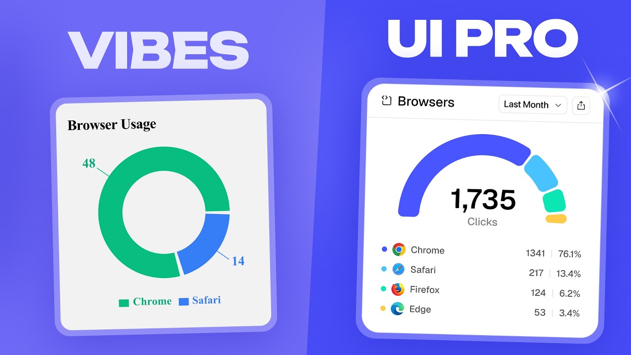
“Vibe coding”—using AI tools like Cursor or Replit to quickly build functional software—is the new standard for rapid development. However, while AI is great at logic, it is notoriously bad at design. If your SaaS works perfectly but looks “off,” you’re likely falling into common AI-driven design traps.
In a recent teardown, designer Kole Jain showcased how to transform a generic, AI-generated URL shortener into a professional product. Here are the five mistakes that scream “vibe coded” and the professional fixes for each.
1. The “Emoji and AI Color” Trap
AI loves emojis and neon colors. While apps like Notion pull off emojis well, most professional SaaS products should stick to standardized icon libraries like Phosphor or Lucide.
The Fix:
- Swap emojis for professional interface icons. [00:30]
- Avoid the “AI palette.” AI often picks bright, clashing colors. Instead, use a cohesive color theory—for example, switching from a generic dark blue to a sophisticated dark green.
- Use micro-charts instead of colored buttons to add visual interest while providing useful data at a glance. [00:54]
2. Repetitive and Lazy Layouts
AI tends to repeat the same “KPI cards” (Key Performance Indicators) across every page. If your dashboard, analytics, and settings pages all look identical at the top, it’s a sign of a lazy layout.
The Fix:
- Tighten the Sidebar: Don’t clutter your navigation with every possible link. Move secondary items like “Billing” or “Settings” into a popover menu. [01:48]
- Information Density: Instead of having three separate links for account details, use a single account card that opens a popover on click.
- Smart Cards: Collapse busy buttons into “triple-dot” menus and use icons instead of text-heavy chips to clean up table rows. [01:54]
3. Sparse Modals and Flyouts
AI-generated “Create” screens are often sparse, wasting massive amounts of screen real estate with just one or two input fields.
The Fix:
- Switch to Modals: If you have a few simple fields, a centered modal is often more professional than a full-width flyout.
- Progressive Disclosure: Hide advanced options by default. This keeps the initial experience simple while allowing power users to find the tools they need (like custom domains or link descriptions). [02:16]
4. Meaningless Billing Pages
Vibe-coded billing pages often include cards that don’t do anything or pricing plans that lack logical hierarchy.
The Fix:
- Clear Tiering: Ensure your pricing follows a logical progression (e.g., Hobby -> Standard -> Enterprise). [04:04]
- Highlight Value: Show the user the specific discount they are getting for annual plans and clearly outline what the next plan includes that their current one doesn’t.
- Two-Column Layouts: Use a clean, two-column layout for usage stats (like donut charts) to make the data more readable than a simple list of numbers. [03:48]
5. “Vibe-Coded” Landing Pages
Landing pages are where you establish trust. A generic layout with “lame icons” tells the customer you didn’t put effort into the presentation.
The Fix:
- Show the Product: Instead of generic stock photos or icons, use high-quality, skewed graphics of your actual software. [05:52]
- Rich Data Visualization: Instead of a boring bar chart, use more engaging visuals like a shaded map for geographic data. Landing pages are about presentation—the better the presentation, the higher the conversion. [06:12]
Leave a Reply