Tag: responsive design
-

Claude 3.7 Sonnet vs. Front-End Web Design: Can AI Actually Design a Production Website?
In a recent experiment mirroring popular web design stress tests, we evaluated Claude’s capabilities in creating a completely production-ready, beautiful, and interactive web interface right from a text prompt. Here is what happened, where Claude shined, and where the human touch is still completely irreplaceable.
-
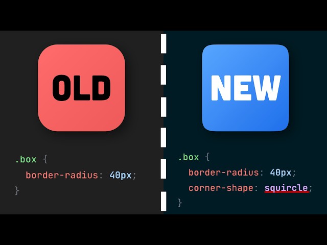
10 New CSS Features You Need to Know for 2026
For developers preparing for 2026 and beyond, mastering these CSS advances will translate into better performance, more adaptable layouts, and fewer headaches during maintenance.
-
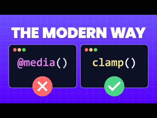
Stop Using So Many Media Queries – Use clamp() Instead!
For years, responsive design has relied heavily on an exhaustive list of media queries to adjust font sizes, paddings, and element widths across different devices. This results in bloated, difficult-to-maintain CSS. The modern solution lies in three powerful CSS functions—min(), max(), and the ultimate fluid design tool, clamp().