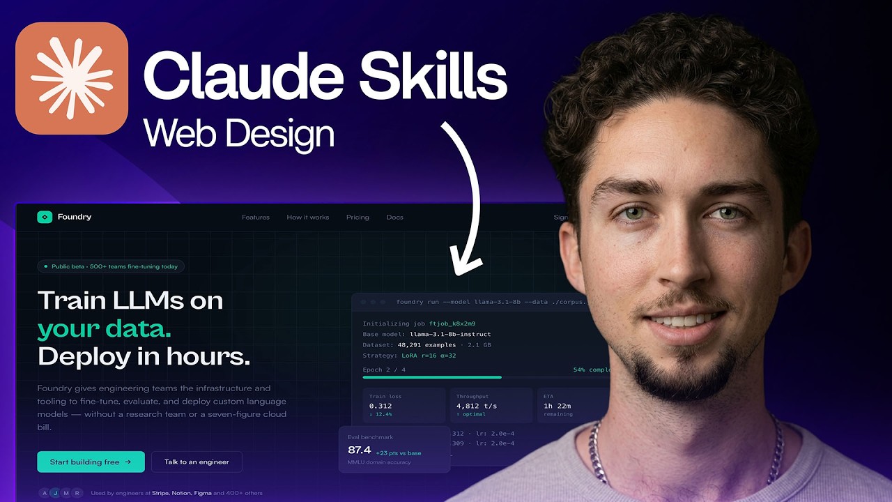
For years, the consensus around AI code generation has been consistent: AI is fantastic for writing isolated backend logic, scripting repetitive loops, or structuring basic database schemas. But when it comes to front-end web design—where pixel-perfect layouts, responsive media queries, modern UI/UX design trends, and cohesive visual hierarchies intersect—the results have often been clunky, generic, or broken.
However, the recent release of Claude 3.7 Sonnet has completely rewritten the script. Known for its exceptional front-end rendering capabilities, modular rule-based systems, and highly context-aware execution paths, Claude 3.7 Sonnet is being pushed to its absolute limits by web designers and developers trying to see if it can replace the traditional Figma-to-code pipeline.
In a recent experiment mirroring popular web design stress tests, we evaluated Claude’s capabilities in creating a completely production-ready, beautiful, and interactive web interface right from a text prompt. Here is what happened, where Claude shined, and where the human touch is still completely irreplaceable.
The Challenge: Building a Modern SaaS Landing Page
To truly test Claude’s web design and development skills, we avoided simple requests like “build a login screen” and instead went for a highly demanding prompt:
“Design and build a fully responsive SaaS landing page for an AI-powered project management tool. It needs a dark mode glassmorphic aesthetic, a sticky navigation bar, an interactive pricing toggle (monthly/annually), a feature grid with smooth hover effects, a functional FAQ accordion, and a clean contact form. Use Tailwind CSS for styling and raw HTML/JavaScript for the logic. Make it look like a high-end web design studio built it.”
1. The Output: Pure Visual Elegance (The “Vibe” Test)
The first thing Claude did was spin up a living, breathing preview using Artifacts. Visually, the result was stunning.
Instead of generating the generic, uninspired blue-and-gray bootstrap layouts typical of older LLMs, Claude leaned heavily into modern UI design aesthetics. It implemented:
- A Glassmorphic Floating Nav: Beautiful translucent backgrounds with precise
backdrop-blur-mdproperties and subtle border highlights. - Sophisticated Dark Mode: A deep midnight canvas paired with soft neon accent gradients (purples and cyans) to draw attention to Call-to-Action (CTA) buttons.
- Typography Hierarchy: Perfect use of bold, tracking-tight tracking headers paired with highly readable, well-spaced secondary copy.
From a pure graphic design perspective, Claude hit a home run on the first attempt. It proved that it understands current visual web design trends, not just historical training data.
2. Front-End Logic: Interactive and Component-Driven
A pretty landing page is useless if the interactive elements don’t work. Claude managed to implement functional UI patterns without breaking a sweat:
- The Pricing Toggle: Claude successfully wired up a JavaScript event listener to a custom-styled toggle switch. Clicking it instantly updated the text values of the pricing cards from monthly rates ($29/mo) to discounted annual rates ($240/yr) with a smooth CSS transition effect.
- The Accordion component: The FAQ dropdowns opened and closed accurately, toggling chevron arrow directions seamlessly and managing height transitions using clean Tailwind classes.
- State Management: The buttons felt tactile, utilizing active and focus states that felt natural for an end user.
3. Responsiveness and Clean Code Structure
One of the ultimate failure points for AI web design is the mobile viewport. Often, desktop designs collapse into an overlapping mess of unreadable text and broken flexboxes when scaled down.
When tested across varying viewports, Claude’s layout adjusted beautifully:
- Grid components shifted flawlessly from a
grid-cols-3layout on desktop to a single column (grid-cols-1) on mobile profiles. - Padding and margin values scaled down appropriately using responsive breakpoints (
sm:,md:,lg:). - The code itself was impeccably organized—semantic HTML5 structure, modular CSS classes, and cleanly documented vanilla JavaScript logic at the bottom.
Where Claude Still Struggles (The Catch)
While Claude 3.7 Sonnet easily outperforms competitors like GPT-4o or DeepSeek in front-end styling and intra-model visual consistency, it isn’t flawless.
During iterative modifications—such as asking it to inject a complex SVG background pattern or demanding highly specialized custom animations—the model can occasionally introduce minor layout bugs. It might accidentally drop an alignment tag or create a styling conflict if you push it through too many consecutive design revisions without resetting its context.
Furthermore, while Claude can generate incredibly polished visual assets on its own, it doesn’t intuitively understand your specific corporate branding guidelines, user persona research, or subtle marketing conversion funnels unless you explicitly detail them in the initial system instructions.
The Verdict: A Game Changer for Web Designers
Claude 3.7 Sonnet is no longer just a basic autocomplete coding tool. It is a highly capable design partner.
If you are a web designer, you don’t need to fear being replaced. Instead, you should celebrate: Claude can completely eliminate the tedious phase of coding basic HTML layouts, wiring up repetitive Tailwind utilities, or writing standard interactive elements from scratch. By treating Claude as an automated front-end implementation layer, you can spend less time fighting CSS layouts and more time focusing on high-level UX strategy, visual storytelling, and polished engineering.
Leave a Reply